Case Study
Cannabis Lifestyle Brand
Crafted Flavor Experiences for the Modern Cannabis Consumer
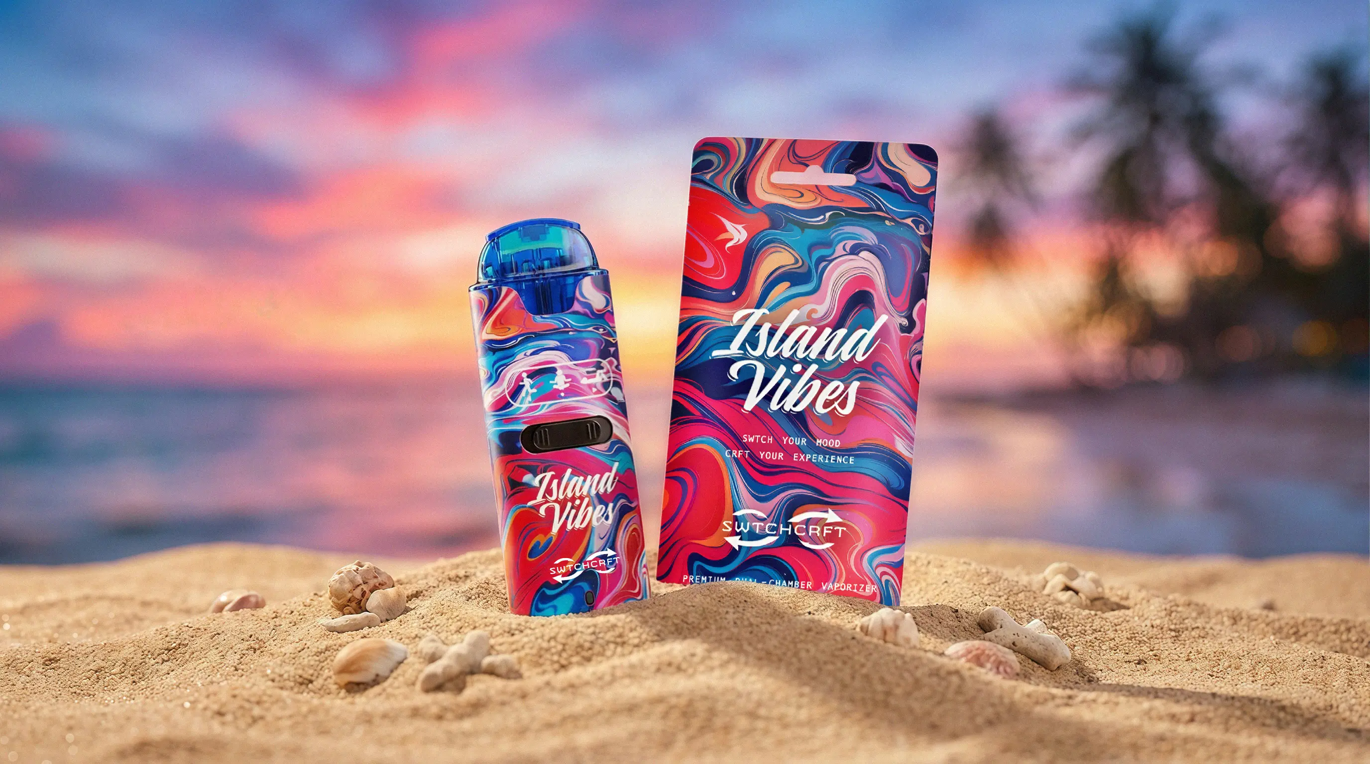
SWTCHCRFT set out to redefine the vaping experience through innovation, versatility, and personalization. Built around a unique dual-tank device that allows users to switch between strains or blend them together, the brand required an identity that reflected both precision and creativity. My role was to design the complete visual foundation for SWTCHCRFT, including the logo, brand identity, color palette, and product packaging. Each element was developed to communicate the brand's core philosophy: empowering consumers to customize their experience while celebrating the craftsmanship behind every strain pairing. The packaging system was designed to support multiple flavor profiles, each with its own personality while remaining cohesive within the larger brand ecosystem.


The final brand identity positions SWTCHCRFT as a modern, design-forward cannabis product that emphasizes control, experimentation, and premium quality. From the sleek logo and bold color palette to packaging designed around the device's dual-tank innovation, the system brings clarity and excitement to the product experience. Each flavor pairing — including Super Blue, Island Vibes, and 5-Star Brunch — is visually expressed through a cohesive packaging system that highlights the individuality of the strains while reinforcing the SWTCHCRFT philosophy: SWTCH your mood. CRFT your experience.


